Redesigned a nationwide gig-staffing platform for be autonomous for hiring managers to post jobs, schedule shifts and pay their gig workers on time.
Client: – (under NDA)
Type: B2B platform redesign
My Role: UX & UI Design
Team: 2 UX leads and 2 UX designers
Timeframe: 5 months
The Challenge
Hiring managers who used the platform to hire gig workers to staff shifts for a wide variety of jobs faced a fragmented, support-dependent interface that:
Required CSM (customer service manager) intervention for initial account setup
75 % of first job posts were still created by CSMs
Offered rigid shift management and low flexibility to edit or modify a shift or job posting
Payroll meant clicking into every single shift, one modal at a time.
Finance managers couldn’t download a clean billing CSV without phoning support.
These pain points created delays, confusion, and low self-serve activation rates.
Research -
Listening before sketching
Methods
5 semi-structured interviews
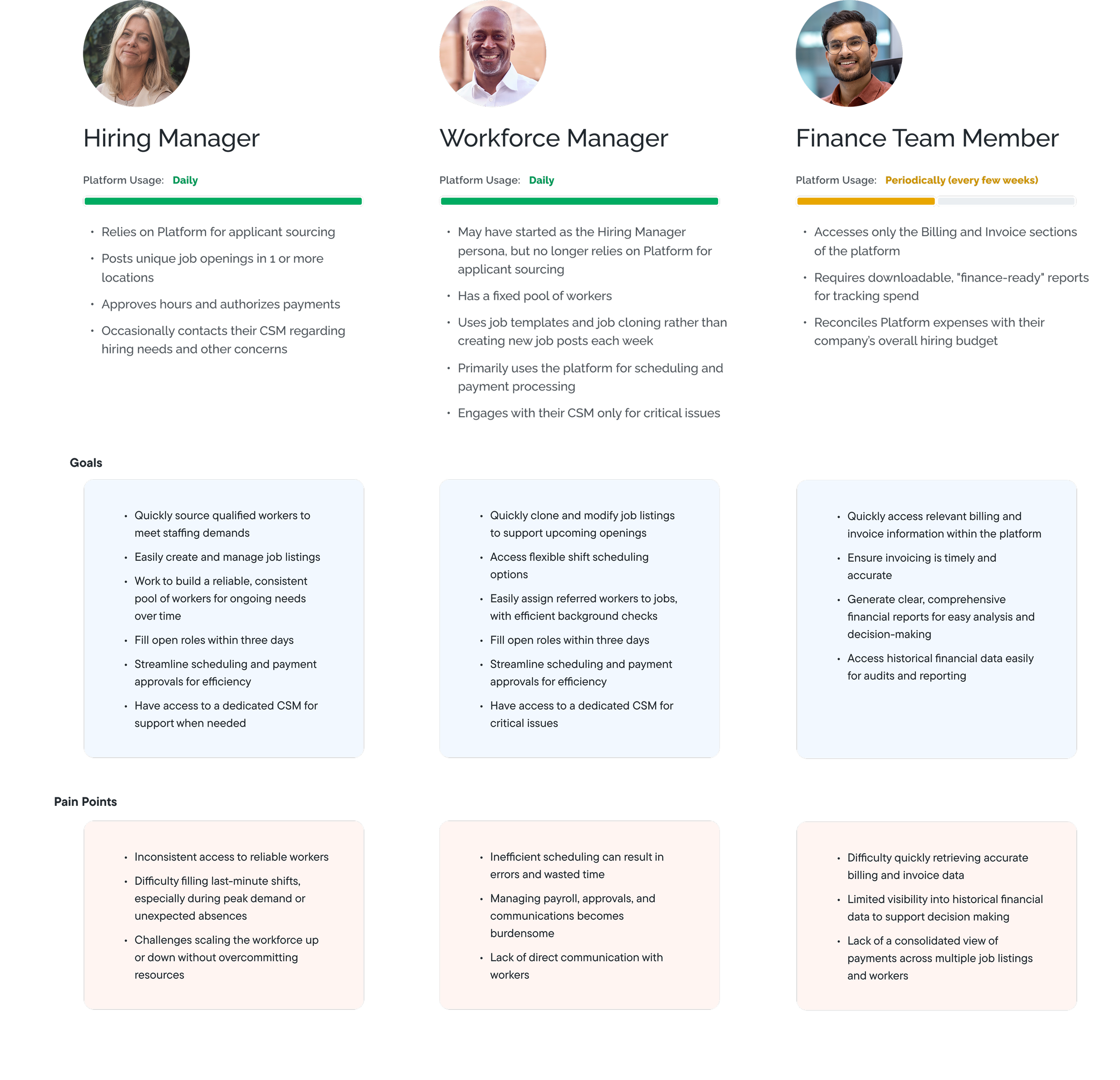
We interviewed Hiring Managers from across industries that were current users of the platform who managed warehouse, events, hospitality, manufacturing, etc to understand all the different kind of needs they may have specific to their industry.
Heuristic audit
A heuristic audit of the current platform’s was conducted over ~2 weeks to understand the different parts of the system.
Jobs board → Posting flow → Payment → Billing
Competitor teardown
We looked at 6 competitors to understand what the industry was serving to learn from their hits and misses.
Mid-week tweaks to hours, headcount, or dates require CSM intervention, proving the job-posting flow is too rigid for shift-based work.
Interview takeaways
Finance leads want richer CSV exports and trend reports so they can analyze labor costs over weeks or months.
Teams need reliable removal tools, and location-based time stamps to keep rosters clean and hours accurate.
After onboarding, key features, especially payments feel hidden, so a living in-app guide or help center would keep teams self-sufficient.
Verifying schedules, cloning jobs, and day-of check-ins are painful on phones, even though site managers are mobile by default.
Managers want more insight into the profiles of the gig workers being hired to understand the worker and their qualifications.
We conducted a comprehensive audit of the existing platform reviewing the main jobs dashboard, the end-to-end job‐posting workflow, the payment processes for workers, the billing history page and the account settings area to identify usability gaps, inefficiencies, and opportunities for clearer navigation and more intuitive controls. This evaluation combined heuristic review to pinpoint pain points and inform our redesign priorities.
Heuristic audit notes
I. Jobs Board
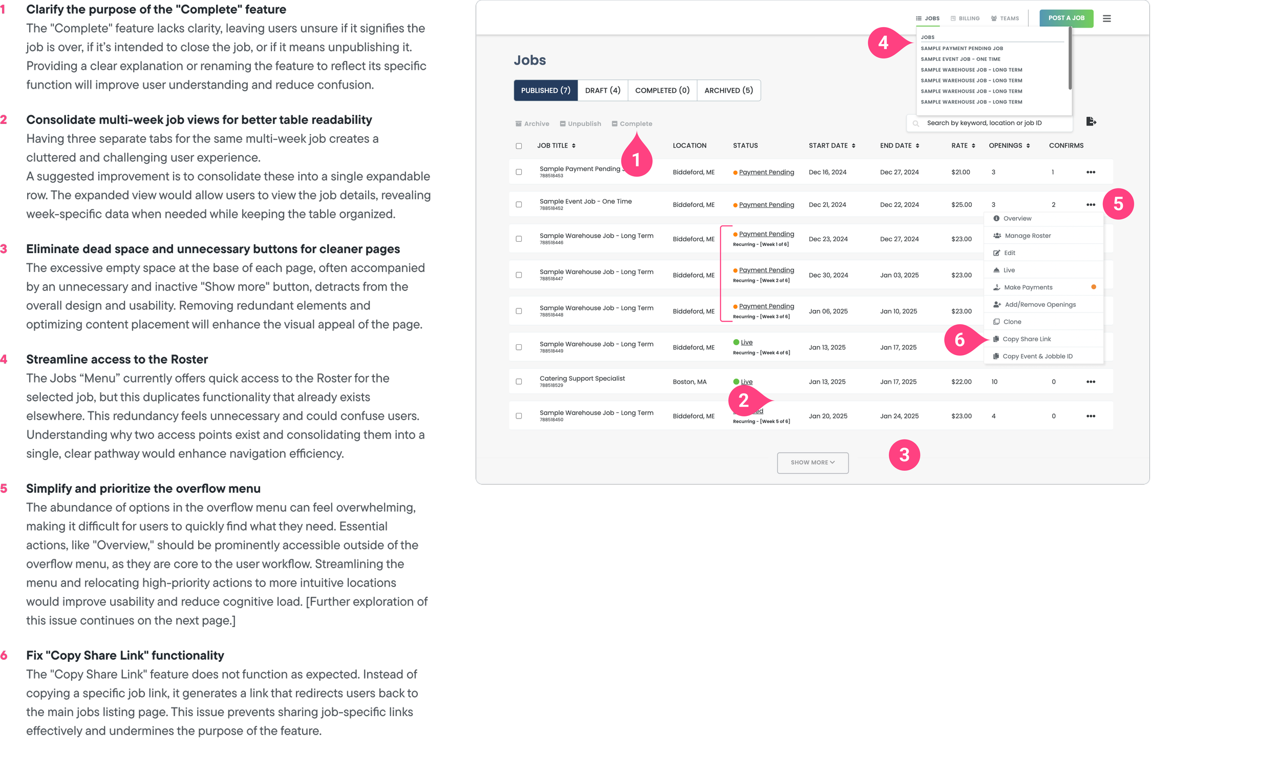
Main Takeaways
We discovered that the “Complete” action lacked a clear label and needed renaming or explanatio.
Separate tabs for multi-week jobs cluttered the table and should be merged into an expandable view
Excessive empty space and inactive controls detracted from visual clarity
Duplicate roster access paths required consolidation into a single, intuitive workflow
Critical actions were buried in an overcrowded overflow menu and needed to be surfaced - and the share-link tool generated generic URLs instead of job-specific links.
II. Posting a Job (a part of the flow)

Key takeaways
Align the preview content order with the navigation sequence for a cohesive experience
Ensure company profile images load correctly in the preview panel
Remove hyperlink styling from non-interactive text to avoid false affordances
Position instructional copy immediately adjacent to the relevant input fields
Enable real-time updates in the preview as users make selections
III. Payment Flow

Key takeaways
Enable batch payments so multiple shifts can be processed at once and reduce repetitive steps
Clarify the reject action label and outcome so managers know whether a worker is removed from payment or the job entirely
Surface total shift duration prominently to help managers cross-check and validate hours
Add explicit save confirmations or clear instructions when editing hours in a modal to reassure users their changes are applied
Competitive Analysis
Competitive landscape: We reviewed six leading platforms to understand self-serve account flows, shift setup and roster management.

Key findings:
Onboarding friction: some competitors ask detailed questions up-front to or understand the needs of a hiring manager looking to hire shift workers
Templating as a force multiplier: Reusable templates reduce posting time
Worker profile: Automated matching boosts fill rates and having open profile of the workers being tasked on shifts increase trust in getting the job done
Automated fill: AI-driven matching and auto-assign features improve fill rates.
These competitive insights informed our redesign objectives, simplifying onboarding, building, bulk-edit features, and simplifying the payment process.
User interviews
We conducted 5 semi-structured interviews with Hiring Managers across industries (warehousing, events, hospitality, manufacturing).
Key themes
Over-reliance on support: 75% of initial postings are completed by support staff; non-tech-savvy users struggle to navigate the flow.
Lack of transparency: users trust the platform’s algorithms but want visibility into applicant prioritization and profiles
Inflexible processes: unable to adjust live postings or bulk-edit forms without duplicative steps.
Key User Groups
Vision
The vision was to create a self-service experience that streamlines payments , and reduces reliance on sales and support teams, giving users greater control and efficiency in their workflow.
Solution and Features
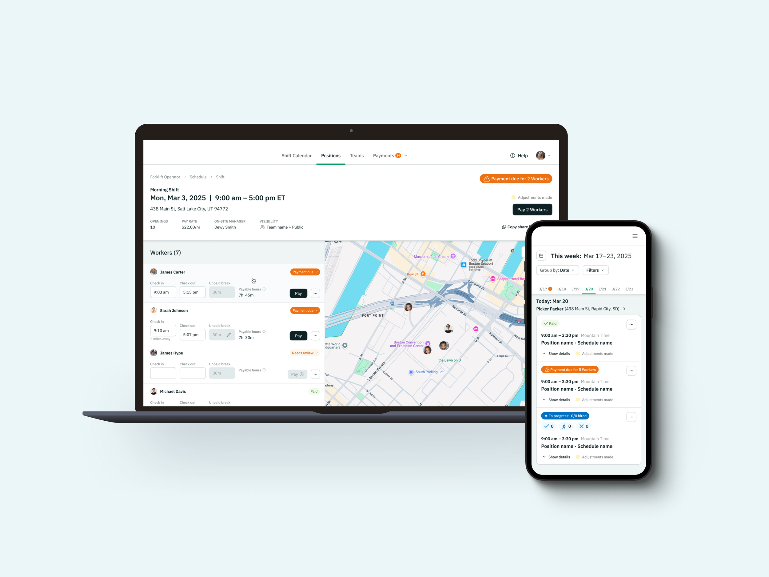
I. From a static table to an interactive shift management calendar
We replaced the static jobs table with an interactive shift calendar landing page so managers can immediately see when shifts start, are in progress, or have passed—all at a glance. By grouping shifts by date (or by position) on a weekly timeline and surfacing key details like pay status, location, and on-site manager, the new view dramatically improves scanability and reduces the cognitive load of hunting through rows of data. Now managers can spot upcoming payments, monitor live shifts, and plan ahead faster and more confidently.
II. Smarter shift view: real-time tracking and easy post-shift edits
During a live shift, managers see each Worker’s check-in status alongside a map that pins their exact location, making it simple to spot who has arrived, who is en route, and who has not checked in. After the shift ends, the same screen switches to an editable table that highlights missing or incorrect hours. Managers can adjust times in line, review payable hours instantly, and trigger payment with a single click, ensuring accurate payroll without chasing Workers for updates.

III. Streamlining payments to enable quicker payouts
We overhauled the payment workflow to let managers pay entire shifts or individual workers across multiple shifts in one step. The old roster view forced single-shift payments with a separate map panel, leading to repetitive clicks. In the redesigned Payments section, you can toggle between “group by shift” and “group by worker” views, review check-in, check-out, and break times inline, then click “Pay X Workers” or “Pay X shifts” to complete all payouts at once. This unified approach cuts manual steps, reduces errors, and makes payroll fast and foolproof.
IV. Human-centered worker profiles
We replaced the bare-bones phone-and-email card with a rich, at-a-glance profile. Hiring managers can now:
Verify trust signals instantly with background-check, mobile-verified, and reference badges.
View a worker’s rating, recent roles, and tenure to gauge fit and reliability.
Scan skills and certifications without leaving the screen, then add the worker to a favorite list for future shifts.
Copy phone or email in one tap while keeping a human picture of who they are hiring.
By surfacing qualifications, history, and contact details in one streamlined modal, managers make faster, more confident staffing decisions.

Project Reflections
We did much more than refresh screens – we reframed the entire staffing service. By mapping every touchpoint from job posting to final paycheck, we uncovered operational gaps and rebuilt both the digital platform to match the offline processes behind it. The result is a seamless ecosystem where hiring managers can post, manage, and pay without hand-holding while workers gain clearer, more human profiles and reliable payouts.
Key takeaway
True impact comes from redesigning the whole service system, not just the UI. When interface changes are backed by strong workflows, backed by real life scenarios, the experience improves end to end and the business sees measurable gains in adoption, efficiency, and trust.